Viewing Driver Model Charts
Once a Driver Model report has been created users will be transferred to a reporting dashboard where users will be able to view their chart.
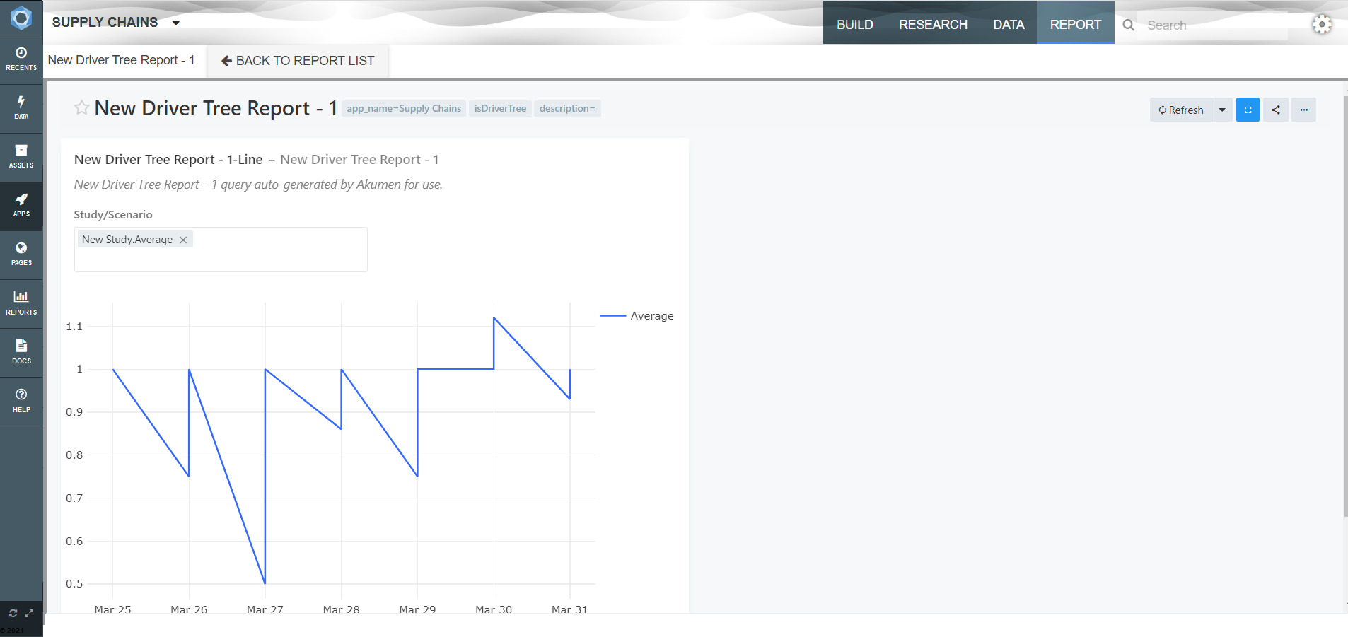
The dashboard will something like this when it first generated:
The chart will be displayed on the left hand side of the screen.
If users have more than one scenario that has been run at the time of the chart’s creation or when the chart is refreshed, the graph will default to display the Average result across all scenarios.
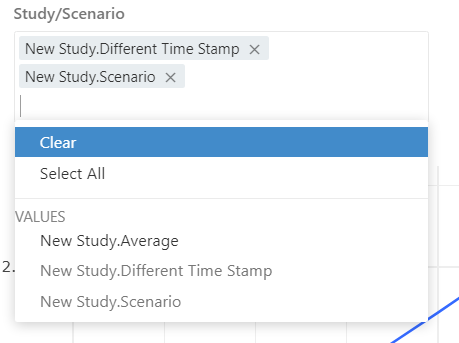
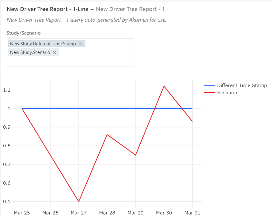
To view scenario results instead of the average click on the study scenario box at the top left of the chart box.
From here users can select whether they want to view all scenarios on the same chart or whether they only want specific ones.
Also on the chart window is a refresh icon. It sits in the very bottom left of the window and tells users how long it has been since the chart was last updated.

 This is important because if scenarios have been altered and re-run or new scnearios were added to the model, unless the chart is refreshed the new results won’t be displayed. However once you refresh the graph it will reset and automatically display the average across all scenarios again.
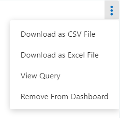
There are also three blue dots in the right hand corner of the chart window. These are only visible if the users has their mouse in the chart window area.

 These dots allow you to access a range of options regarding the chart window, such as downloading the report (called query by the integrated reporting program) and editing the chart if users wish.

Once users are done viewing their chart to get back to the reports page all they have to click is Back to Reports List at the top of the dashboard.
