Creating Reports for a Python or R Model
When an application runs in Akumen, any outputs specified in the code will be pushed to the Data tab. The data stored here can be turned into a report in Akumen.
To create a new report:
- Go to the Report tab (next to the Data tab).


- Hover over the blue “+” button at the bottom right of the screen
- Select Blank Report from the options list.
You will be taken to your Reports dashboard. The dashboard is actually a reports service called Redash. For this part of the tutorial we will only go into how to put the report together and for information on redash and the dashboards you can click here
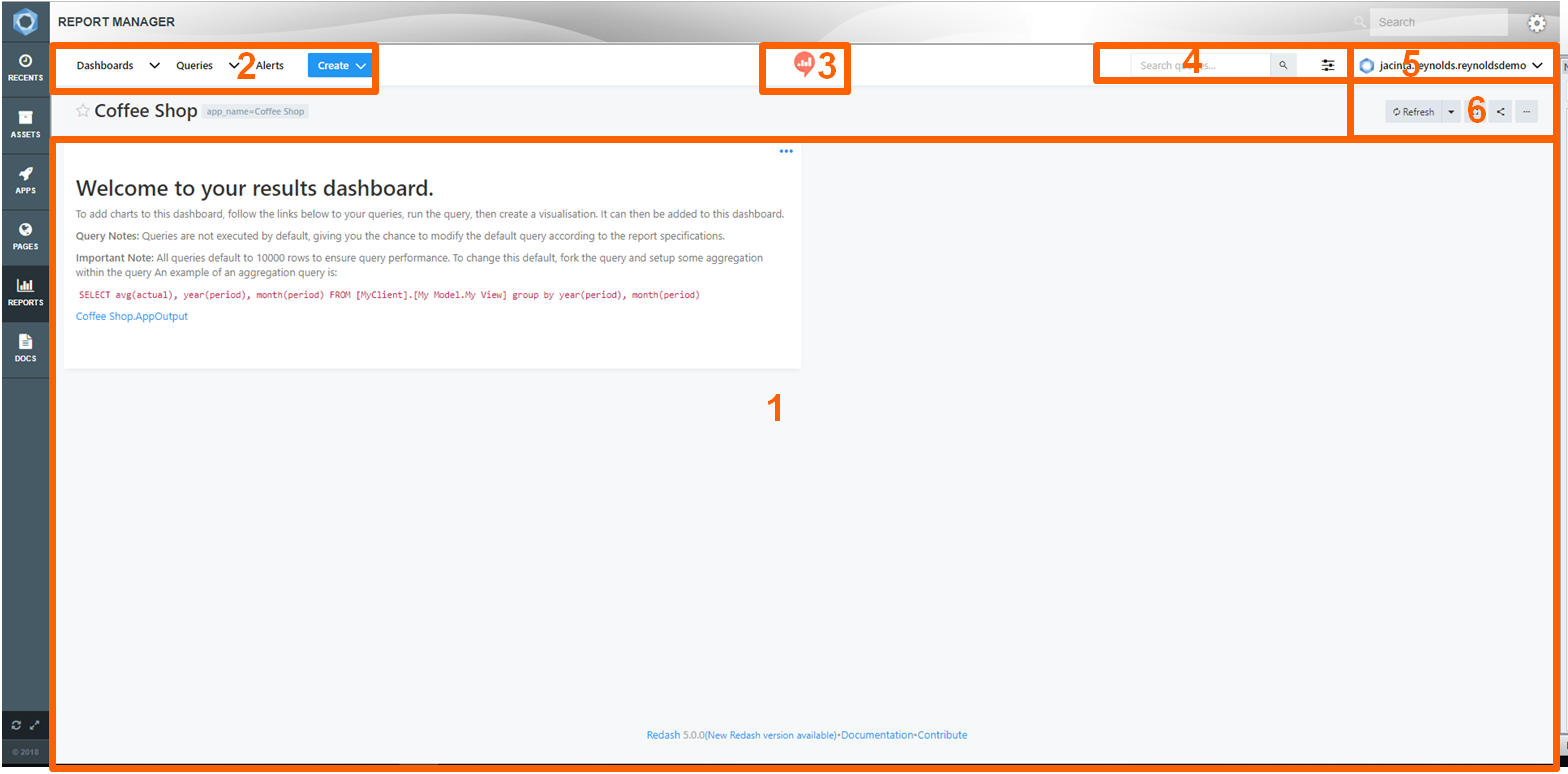
Before you do anything click on the full screen symbol  at the top right of the screen so that you can see the full dashboard. The reports dashboard has six parts to it:
- Your Dashboard;
- The Menu;
- Favorites Link;
- Search Bar;
- User Options; and
- And Dashboard Options.
When your dashboard is created you will see that the current text box on the screen gives you instructions on how to set up a query in order ot create your first graph.
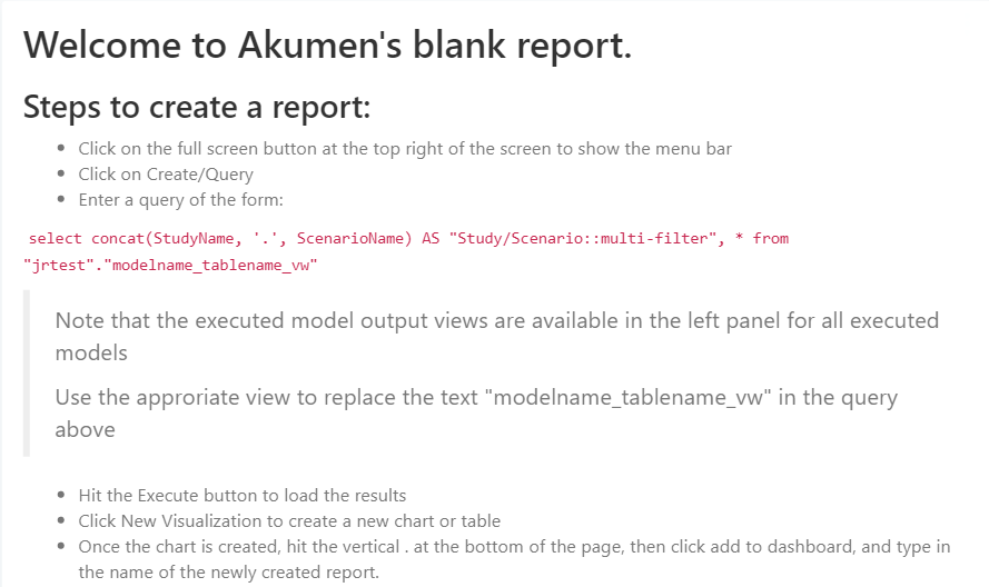

By following these instructions and the directions to create queries we can create lots of types of graphs.
As the text box says the first thing that users will need to do is go to the create button at the top of the screen in the navigation bar and select Query from the list.
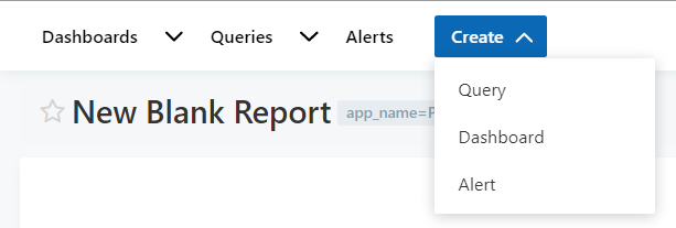

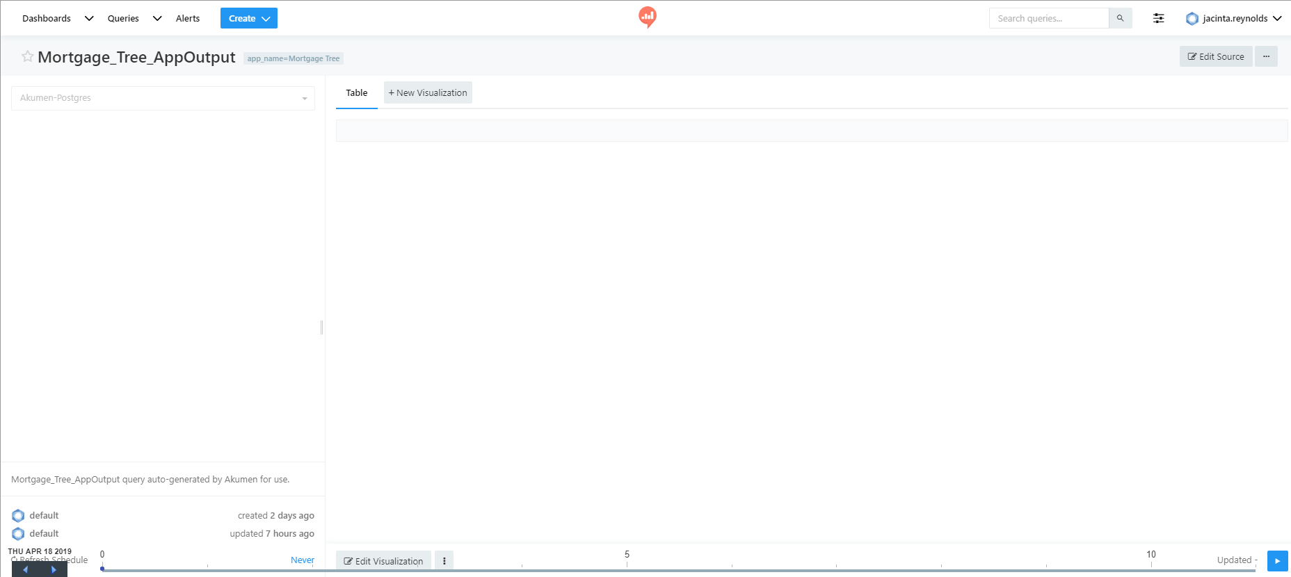
By selecting Query you will be taken to the queries page.
The query page has two main parts to it. The right side of the page is where the pulled data and visuals are displayed, and the left side where the Schema Browser is. The schema browser is where all the currently executed model output views are available for every model in that particular client.
The first thing to do with this screen is to copy and paste the line of code in the text box into the code window at the top right of the screen.
select concat(StudyName, '.', ScenarioName) AS "Study/Scenario::multi-filter", * from "client_name"."model_name_table_name_vw"


The client_name will already be preset in your line of code to the client you are currently in. You will want to replace the model_name and table_name_vw with the appropriate model name and table that you want to draw data from. The table you will want to select will say something along the lines of coffee_shop_python_app_monthly_balances_vw. The model name will change depending on what you named your model.
Once you have entered the query, execute the model to pull the result into the model. From here you can create your graph by clicking on Edit Visualization or New Visualization.
There are two types of charts that we can create;
- Exploratory; or
- Static.
Static visuals require specific code so that they only plot specific scenarios, and exploratory allows users to see all of the scenarios in a study and model on the one visual.
